| Home | | | About | | | Paintings | | | Events | | | Blog | | | Mailing List | | | Links | | | Contact & Price Info |
Blog
(posted on 29 Sep 2021)
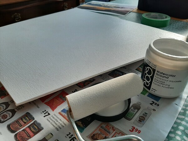
One of my art co-ops decided to have us all work on a large panel, cut into individual pieces that form a puzzle. Each of us was given a gesso covered birch panel to paint. I thought about painting on paper and gluing that to the panel, just trimming off the excess. But then I decided it would be a great chance to try watercolour ground.
Watercolour ground is an acrylic medium that can be applied to a variety of surfaces, in order to make them more absorbent so that they will work with water media like acrylic and traditional gouache. So I bought some ground (QOR brand) and applied it to my panel with a foam roller (hoping this would give me a nice even surface).
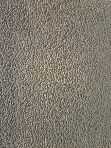
One coat of ground was too thin and showed the gesso brush strokes. Two coats was very smooth, like a hot press paper, even though this is said to be a cold press ground. Three coats was very rough, rougher than cold press or even rough watercolour paper. When wet, the ground smelled vaguely like cat pee. Still, one must press on.
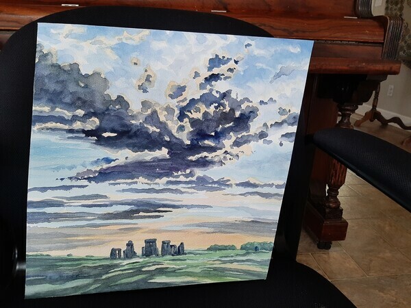
I found the ground still absorbed poorly. It felt like working on cheap paper. It took several coats of paint to build up any saturated colour, and it still looked bland. It does work - I was able to use ordinary, professional grade watercolours to paint on the surface - but I was not especially thrilled with the results.
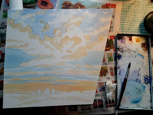
At the end of the day, the panel is going to be varnished with Golden spray varnish to keep the surface intact. I am hoping that this will make the colours look more saturated. My final assessment: not my first choice for a watercolour painting, but perhaps useful in some mixed media applications in the future.
For more reading on watercolour grounds, here's a good article online: https://www.jacksonsart.com/blog/2020/02/18/watercolour-grounds-painting-with-watercolour-on-canvas/
(posted on 28 Apr 2021)
Commissions are art works specifically painted for a customer, at their request. Sometimes it is done for an individual, sometimes for a corporate client. A good overview of commissions is here: https://www.artacacia.com/blogs/posts/art-commission-guide-how-do-artist-commissions-work
I rarely do commissions. I find they stress me out. I feel under pressure to have the art be a success. Often, the subject is not one I would have chosen, or includes elements I would not normally enjoy drawing or painting. On occasion I will do them, usually as gifts, when the subject is something meaningful to the customer, and the customer is someone meaningful to me.
I find the key to a commission, when someone hands over a snapshot of their pet, or vacation, or wedding, or the like, is to find out one key thing. What is it about the scene that they really react to? Usually a photo, if someone wants it immortalized in a painting, is of a place or time or person that evokes an emotion or memory, and usually there is some element of the photo that is the significant thing - to them.
It might be the time of year (I always loved going fishing at the cabin with Dad in autumn), or the expressions and postures (my dog always tipped his head to the right just like that when he wanted a pet), or the lighting (we used to sit on the beach for drinks every sunset). You need to find the key elements that the client wants in the painting, not what your artistic sensibilities might dictate, and then arrange them as best you can into a good composition etc. If it was that emerald green water that the customer remembers, don't make the water blue. Or purple.
Find out too what can be left out. You might think the ugly post in the front wrecks the composition. Your customer might remember that as the hitching post grandpa built, where everyone tied their horses to unsaddle. Don't take your usual liberties until you know. I also find it is useful to have the customer see the concept drawing, and have them make key decisions (can I move that post over here?) You are trying to capture the feeling for them of the scene that they see in their mind's eye.
Love at Maple Bay, watercolour
This is a recent example. The customer's photo had several boats, a pier, a foreground railing, and was longer and thinner. But what they remembered was the sky and the mountains and really what they wanted was to capture the day they consider their first romantic date. So this painting was about capturing the mood and the natural landscape, and I was able to simplify the busy foreground and just include one boat to provide some interest and colour in the foreground.
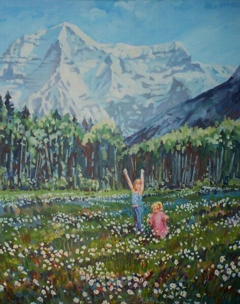
Springtime, acrylic
Here's another example. My mother had a series of photos she took at my brother's cabin in the mountains. She had some lovely memories of trips there, with her two granddaughters. I was able to do a composite drawing from her photos, and some of my own mountain pictures from the area, and then translate that into a unified scene. Essentially, I was recreating my mother's memory from several rather poor snapshots. But it was the wildflowers, the location, and most importantly the girls, that formed the essence of the scene - the rest is all detail that doesn't really matter, including changing the t-shirt colour for one of the kids as a bit of artistic licence. The key was capturing the feeling of the moment for her.
I chose to work in acrylics rather than watercolour as I felt at the time it would make rendering the very complex field of flowers easier to deal with, and also made it a bit easier to change details of the girls if anything was not "quite right." There's something to be said for a medium that allows you to just gesso over a spot that you mess up, haha. But see, there it is ... that pressure to have the painting "work" that makes me avoid commissions for the most part!
(posted on 2 Sep 2020)
"Homage refers to an act of showing respect or tribute towards someone or something in public. In the context of art, the term refers to a painting, movie or another work of art where the artist adopts the content or features of another artist or work as a mark of respect."
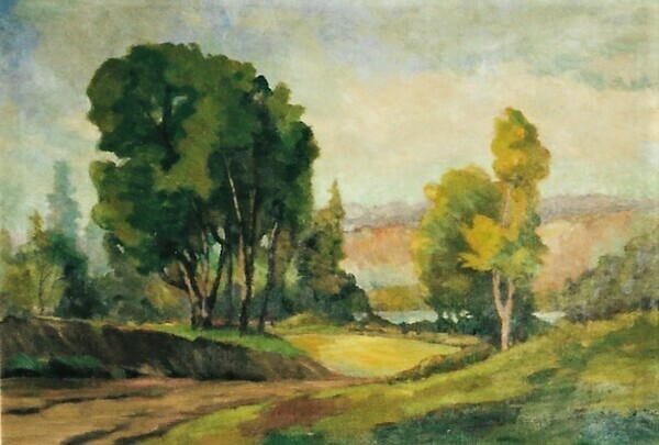
I have written before about my grandfather, J Gordon Sinclair, who was a founding member of the Federation of Canadian Artists as well as other western Canadian art societies, and a prolific oil painter. He also taught me drawing, pastels and oil painting as a child. I own several of his paintings, and have photographs of many more, and I decided I would try to use photos of some of his art as inspiration for some paintings of my own.
In many respects such homage to an early artist is common; we have all no doubt copied Monet and Renoir and others in art classes. One can learn much from such efforts. The resulting paintings are often lovely, but cannot be entered in juried shows or galleries of course. If the artist were contemporary, such a copy would be a copyright violation, of course. But more importantly, whether the artist is contemporary or long deceased, such a copy is largely the original artists' work, not yours! The selection of subject, the composition, the values, the colour palette - really all the main principles of design - have been chosen by the original painter. Thus, the resulting new work is not, largely, the original work of the current imitator. (This is also why many shows and galleries won't let you use someone else's photo as a reference, even if copyright permission has been granted.)
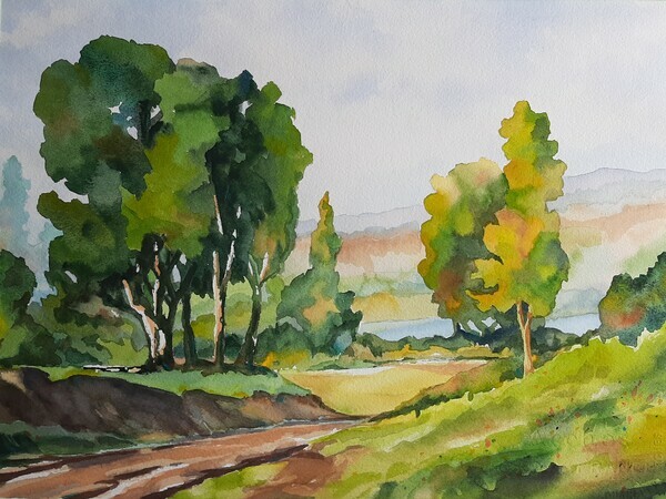
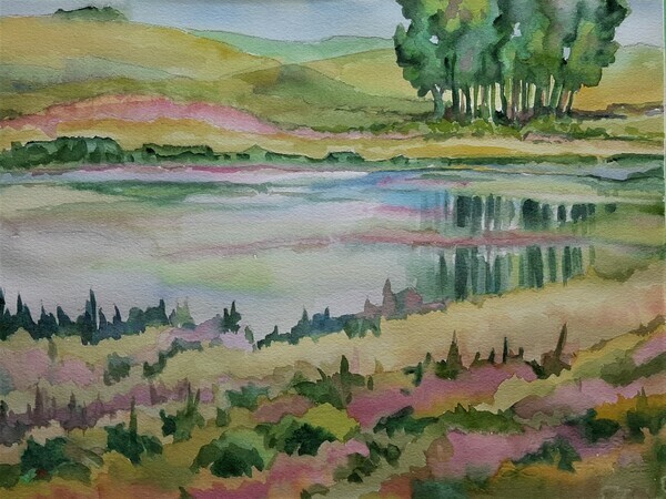
Despite these limitations, I spend some time during the Covid lockdown with some photos of Grandpa's oil paintings, and "reproduced" these in my own chosen medium of watercolour. The results to me were as much about connection to my artistic roots and long lost family as they were a homage to his art. I wish I knew more about these paintings.... long since sold to collectors, I have nothing but poor photos of the originals, with no real clues as to where they were painted nor when.
At any rate, here they are:
Land Remembered, Elaine Hughes, Watercolour on paper, 11 x 15
Title Unknown, J Gordon Sinclair, Oil on panel, size unknown
Vale of Memory, Elaine L Hughes, Watercolour on paper, 11 x 15
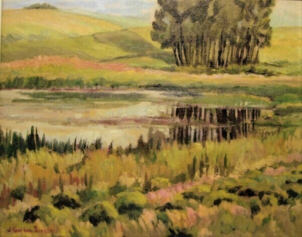
Title unknown, J Gordon Sinclair, Oil on panel, size unknown
Can You Remember? Elaine L Hughes, watercolour on paper, 11 x 15
Title unknown, J Gordon Sinclair, Oil on panel, size unknown
(posted on 26 Apr 2020)
Well Covid-19 has certainly disrupted galleries, workshops, openings, shows, studios, exhibits and artists practices and sales. Thankfully, with modern technology a lot of shows are being mounted online and even workshops are going virtual!
For teaching or taking workshops, one option is to offer classes online. Not just doing videos, but actually live, interactive sessions with students. I just took a class on Zoom and it was really good. The instructor hadn't done it before but she was really happy with it, and has already scheduled more. All the students really liked it too. We had two, three hour sessions. The instructor had a camera on her face (smartphone) and one on her palette/paper (webcam I think). There was a moderator who set up the sessions and sat in so she could keep track of time (eg, for a bathroom break in the middle), switch views from the palette to students (eg, so we could hold up our work in progress for the instructor to comment), deal with technical problems (eg, muting mics). I think this was vital. There were 15 students, and a supporting Facebook page for people to post their finished work and get critiques from the instructor.
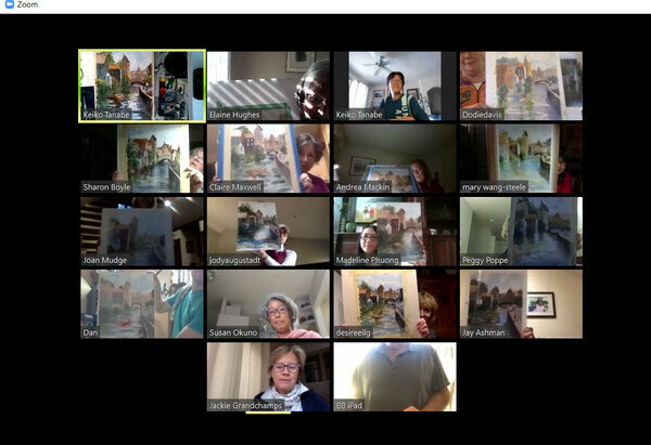
This is the gallery view of the session. From here, the moderator can get everyone to switch to a closeup view, either of the instructor (Keiko Tanabe, up top) or to her palette (top left) or to an individual student who has a question or wants a critique. Here we were all holding up our pieces for a group shot :) The moderator (Jackie) at the bottom was hosting the session and did all the organizing and technical work for the instructor. Students need a camera and mic on a phone, tablet, laptop or PC.
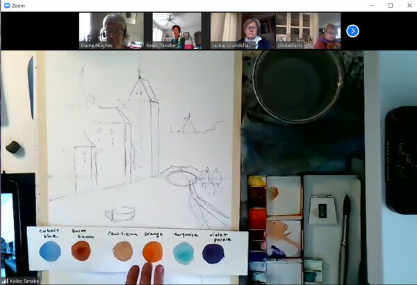
Here is what the session looks like when everyone switches to the alternative view. The moderator then picks which frame shows as the enlarged part of the view. Here the instructor's palette and paper is shown, together with the drawing that she is working on. Remember this is all live so she is talking and explaining as she demos. Here she has inserted a colour chart into our view in order to explain her palette.
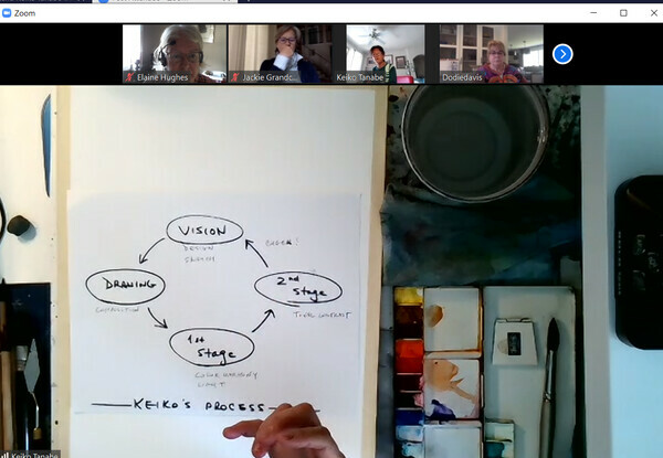
The instructor also had various "slides" or diagrams that she used, similar to having a power point or whiteboard available, that she could simply put into view when she wanted to explain something. Here is her process shot.

On a reasonably sized screen, the zoomed in view of her palette and paper allowed us to clearly see what she was doing, possibly better than one can usually see at a demo. Her own tablet with her reference photo was just to the left but she brought it into the view when she wanted to point out something to us. Up top you get the view from the students' cameras and the moderator can bring up into the main screen the camera and sound of anyone who wants to hold up their work for the instructor, which we did in turns a couple of times each session for feedback. The instructor would demo a bit, we'd work a bit, then she'd demo some more. She worked fast and we did two paintings. Our work was finished outside class and posted on a private FB group for critique.
For this session both the Zoom session and the FB group were super well organized by French Escapades. Check out their website for more virtual art workshops, and Keiko's webpage for more of her virtual workshops, both with them and other organizations.
Here is one of the paintings that I did during the session:
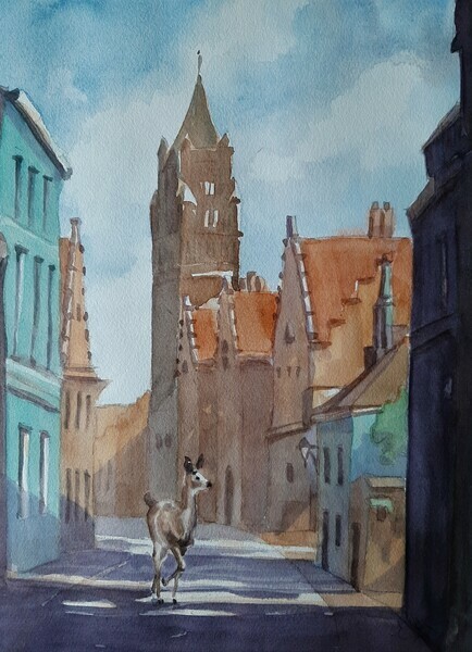
Oh Deer! Where Have All The People Gone?
Elaine Hughes
Watercolour on paper, 15 x 11
(posted on 14 Feb 2020)
Well last year I got hooked into a group of folks on southern Vancouver Island called the Sooke to Sidney Rock Hunt (SS Rock Hunt on Facebook). The idea is to paint on small round rocks with messages or images and then (fairly obviously) hide them along trails and beaches. Other people find them and can either keep them or re-hide them. It's really fun, especially for kids, and it really is pretty cool to find them. I was happy to participate with artist friends and random neighbours and it all seemed quite lighthearted. Although finding good smooth rocks took some effort.
There was a bit of discussion in the group about possible environmental harm if you didn't seal your rocks and the paint washed off or chipped off. Another issue that came up is making sure you didn't put rocks on private property, in graveyards, and in open-to-the-public places like malls if the owners didn't like it. But then I ran across a more troubling controversy - was it OK to put such "unnatural" art objects in places like parks, especially those of the nature preservation variety. When someone likened them to graffiti, I started doing some reading.
It turns out that this idea, in the US often called "kindness rocks" wasn't new, nor was the controversy over placement of such painted bits of mini art in wilderness areas, such as beaches and parks. Not only were the rocks likened to graffiti (which has had it's own controversy over whether it's vandalism or art, of course), but were also deemed analagous to trash or litter. Which, in leave-no-trace areas, is quite possibly a good point.
Here's an article about the controversy in the US, which has some interesting history about the rock painting hobby as well: Between a (Kindness) Rock and a Hard Place.
While I had always left my rocks on dog walking trails and made sure nothing would be disturbed in placing or collecting the rocks, I did find my own interest waned once I thought about what I valued in nature, and what I valued in art. The environmental artists that I like do works that in fact leave no trace, and are designed to fit into nature in a way that is temporary and respectful. People like Sally J Smith, whose art leaves no permanent record of itself except for photographs that she takes of it.
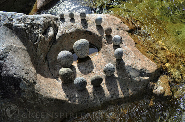
Installation by Sally J Smith, copyright Greenspirit Arts https://sallyjsmithart.com/
So, these days, I don't paint on rocks any more. It just seems to me to be treading ever so slightly more lightly on the path.
(posted on 14 Jan 2020)
Well I realized I should either stop pretending to have a blog, or post something in it. I have several topics of interest to muse on, but life has intervened. Now that I have resumed a more settled existence, I am back finding more time for art. With me are my cats, as always. But in the process of leaving the old house, I left behind some footprints on a window ledge that a now-deceased kitty had left behind, so I photographed his paw prints in the hope of incorporating them into a future painting.
 Barney's Art
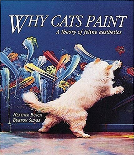
Years ago, Heather Busch and Burton Silver published a whimsical book entitled "Why Cats Paint" showing cats painting abstracts, which Amazon describes as "An unprecedented photographic record of cat creativity that will intrigue cat lovers and art lovers alike." Well, it was fun, albeit unscientific, and spurred many people at the time to try convincing their cats to paint.
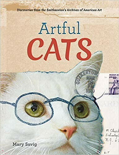
On a more serious note, a recent book entitled Artful Cats by Mary Savig caught my eye. It's an investigation, using works from the Smithsonian, of various famous artists' relationships with their cats, providing a glimpse of the personal lives of many of these artists in the process. Again, from Amazon:
"Artful Cats explores the quirky and charming relationships of artists with their cats in 130 rarely seen photos, paintings, sketches, manuscripts, and letters from the Archives of American Art. Jasper Johns, Frank Stella, Louise Nevelson, Marcel Breuer, Yves Tanguy, Georgia O'Keeffe, Edward Weston, Robert Indiana, Judy Chicago, Berenice Abbott, and Romare Bearden show off their artful cats, which appear as companions, inspirations, instigators, and often regents of the home or studio."
I don't often paint animals, but when I do, it's usually my cats. Perhaps it's something to do more often.
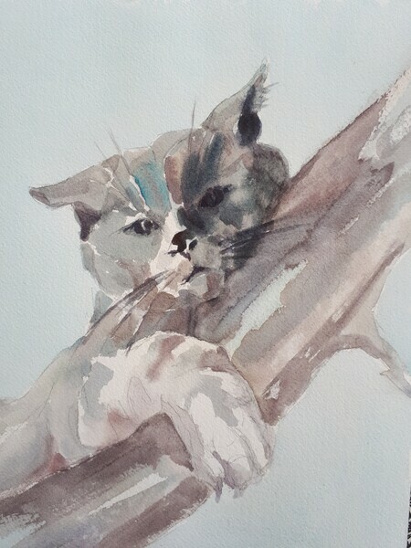
"Griffin"
Elaine L Hughes
12" x 9" watercolour on paper
(posted on 20 Apr 2019)
As a glaucoma patient and visual artist, I became interested in the effect of blindness on the ability to paint. As it turns out, it's not always critical. The first thing to realize is that most folks - about 93% - who are legally blind are not totally blind, and retain the ability to see some values, colours and shapes. In fact, going blind is a process, with inconsistent, light-dependent effects and a changing patchwork of impairment. One of the best descriptions I have read is Annalisa D'Innella's article "The Way I See It."
There have actually been some interesting books about the effect of various types of visual impairment on artists. The seminal work in the area is Patrick Trevor-Roper's book "The World Through Blunted Sight," first published in 1970 and revised and reprinted in 1988. It's available on Amazon here. The author, an opthalmologist, describes the effect of various types of visual impairment (due to cataracts, colour blindness, myopia, etc) and the impact that he theorizes it had on a variety of artists and writers, and the way they conveyed their visual impressions of the world. Unfortunately from my viewpoint, glaucoma (which causes loss of peripheral vision first, and can lead to total blindness over time) is given short shrift in the book.
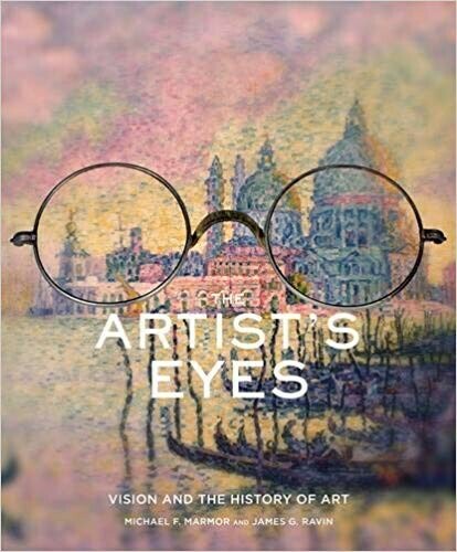
A more recent book along the same vein is Michael Marmor & James Raven's 2009 book "The Artist's Eyes: Vision and the History of Art." It is also available on Amazon here. It is a series of case histories that looks at the impact that eye disease may have had, over time, on the works of several famous artists, particularly Impressionists Renoir, Degas, Van Gogh and Monet. (The authors also have an earlier work on the topic, the 1997 title "The Eye of the Artist.")
There are also some books out that help blind artists learn how to go about creating art, such as Elisabeth Salzhauer Axel’s book "Art Beyond Sight" (available here).
Keith Salmon, "Towards Ben Lomond, winter" 2017
Not all blind artists are historical figures. For example, Keith Salmon is an award winning Scottish landscape artist who exhibits regularly, who suffers from diabetic retinopathy. More about Salmon and his work can be found on his blog at http://www.keithsalmon.org/ Another well known artist, who died in 2015, was Sargy Mann, who lost his sight to cataract surgery, retinal detachments and burst corneal ulcerations. Information about Mann is available at http://sargymannarchive.com/ They and other contemporary artists have shown that visual impairment, even total blindness, can't stop artists from creating art!
Sargy Mann, "Three Figures By The Sea" 2014
Where will changing eyesight lead me on my own journey? Time will tell.
(posted on 7 Oct 2018)
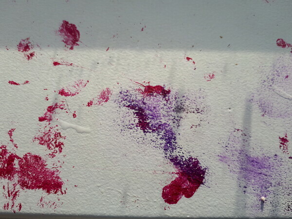
Years ago, in my days as a zoologist, I studied animal art, or more accurately art by animals. Desmond Morris was a big name, along with Congo the chimpanzee and his abstract impressionist paintings. Many other instances of people encouraging human-style painting by animals - elephants, dogs, other primates, dolphins - have been documented. One of the most noted was the humourous book "Why Cats Paint" by Heather Busch and Burton Silver. It also continues to be the subject of more serious study.
 Painting by Congo (chimpanzee)
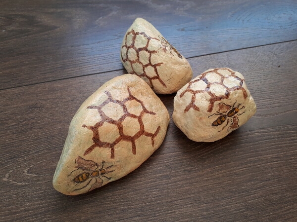
Of even more interest to me these days, however, is the idea of natural animal behaviours being expressed in a way that human artists can integrate into their own creative work. Perhaps the epitome of this is the scuptural work of Aganetha Dyck, who combined her porcelain work with the building of honeycombs by bees to create remarkable interspecies constructs.
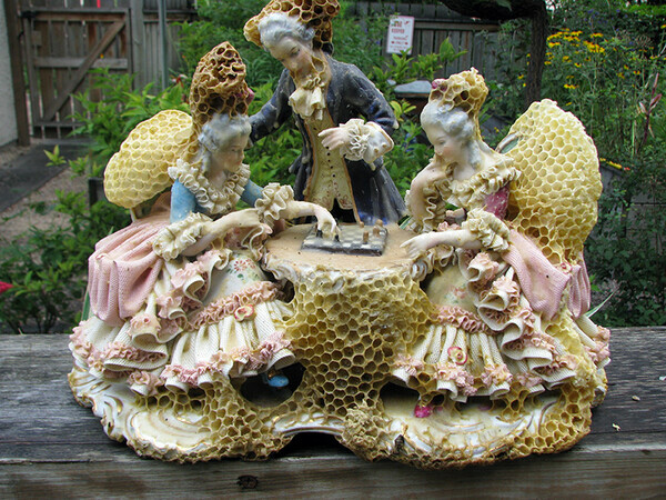
Sculpture by Aganetha Dyck (with honeybees)
Another very interesting collaboration that goes one step further is the work of Diana Scherer, who creates her artworks by interacting with the growth of plant root systems, creating remarkable textiles in a sort of collaboration with living plants.
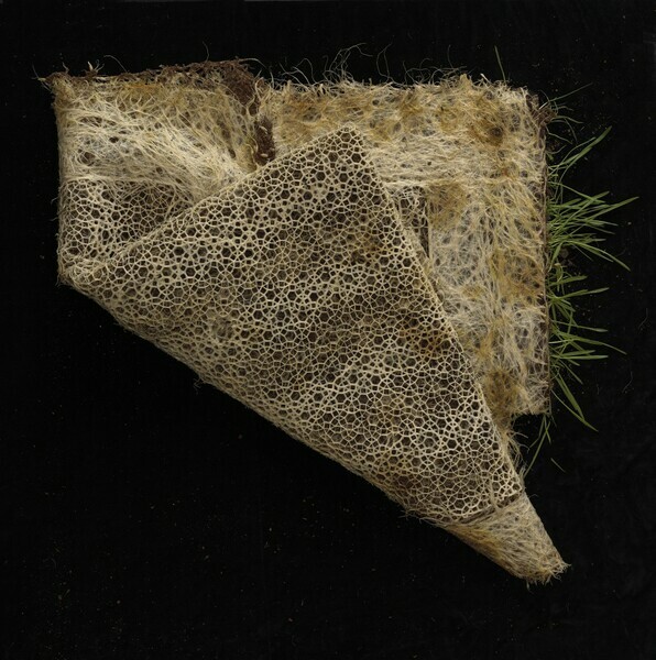
Textile by Diana Scherer (with root systems)
All of which makes me alive to the possibility of some type of collaboration with my own animals and plants. So, we shall see what comes of it, beyond the acrylic paint cat footprints on my windowsill.
(posted on 30 Jun 2018)
There has been lots written about famous collaborations in the art world, and how unique creations can arise out of such a meeting of minds. See, for example this article.
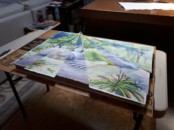
While my latest project is somewhat less illustrious, it certainly was fun and inspiring and resulted in some art that I wouldn't have done on my own. With an eye on an upcoming show at our local art cooperative, artist Linda Anderson and I decided to paint a nearby sculpture, the Moss Lady in Beacon Hill Park, Victoria, BC (patterned after the Mud Maid in the Lost Gardens of Heligan, England.
The plan: each paint a full sheet watercolour. Mine in summer, Linda's in winter. Combine them somehow into two fused paintings. Become famous! Or at least impress ourselves with our success :)
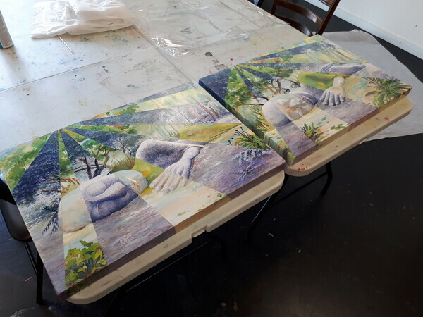
The process ended up being complex. Linda did a drawing to which I added bits. We both traced the same drawing on to our watercolour sheets. Once the paintings were done, I did a bunch of design prototypes using colour photocopies. Once we settled on a plan, Linda bravely chopped up the paintings. Then we mounted them on wooden cradles, varnished them and Linda painted the sides in acrylic to imitate a gallery wrap. The hardest part seemed to be coming up with names!
Here are some photos of different stages of the process:
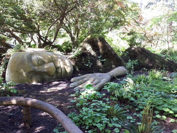 The Sculpture
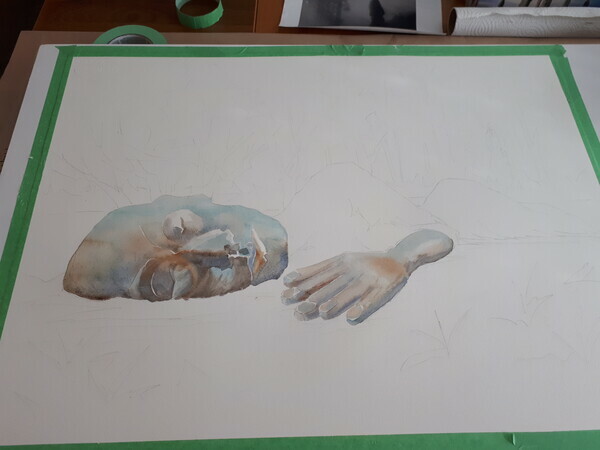
The Drawing & Starting to Paint
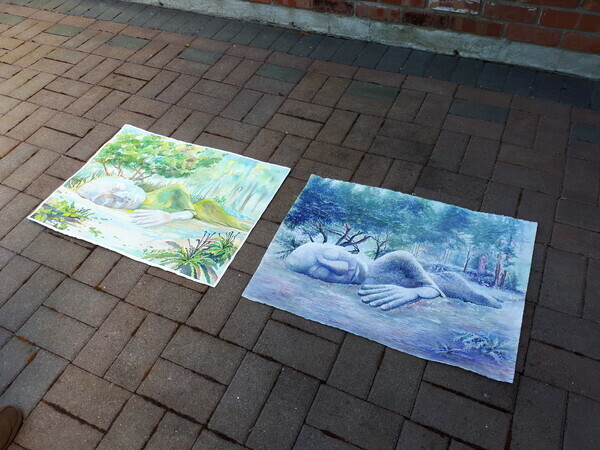 Two Paintings
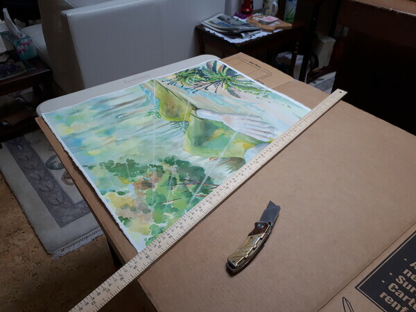 Cutting them up
Pieceing them back together
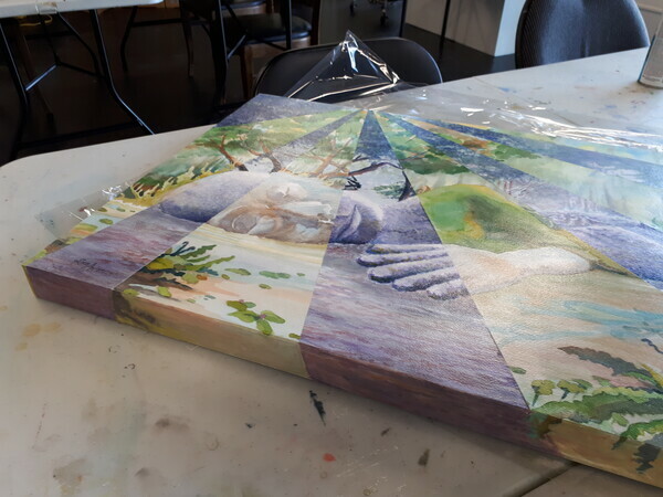 On the Cradle
 Varnishing
The finished pieces will go on exhibit at the Coast Collective's Collaborations show, August 2018.
(posted on 13 Apr 2018)
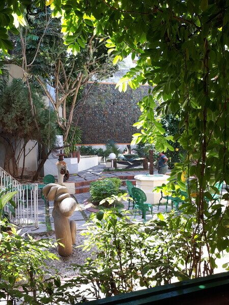
Havana Courtyard
Recently I went to Cuba for the first time. Ahead of the trip I knew little about Cuban art, but as it turns out there's a fabulous tradition of visual arts and craft as well as the more stereotypical music and dance scenes. There were two sites in Havana that were particularly interesting.
The first was the Museo Nacional de Bellas Artes de Cuba, in particular the building housing the Cuban collection. It was a fabulous collection of Cuban painters from colonial days until the present and featured some of their best known artists.
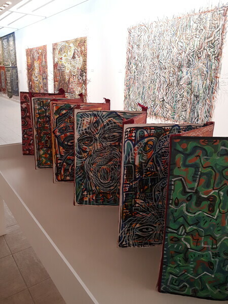
Exhibit of work by Leandro Soto
The second was the Fabrica de Arte Cubano, a converted paper mill that serves as an exhibition space for the visual arts, dance, music, theatre, film, etc, as well as housing a bar, nightclub and restaurant. With a clear focus on modern art, this was clearly one of the 21st century hubs for the Havana arts scene.
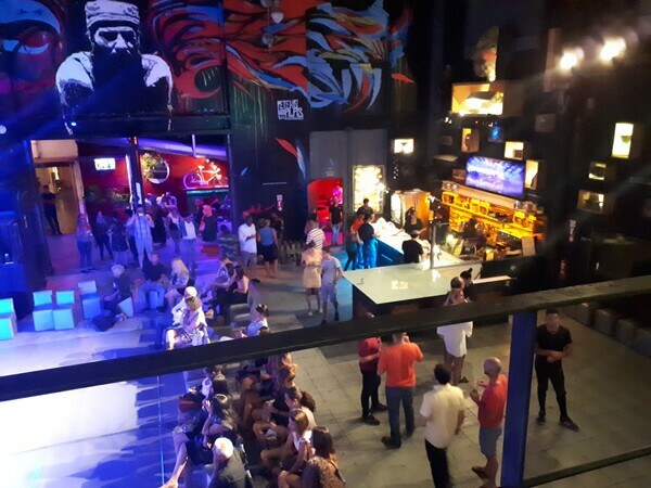
FAC Dance stage and bar
While I can't say that this brief trip provided enough time to truly immerse myself in Cuban art, it certainly provided an interesting taste of what I've been missing so far! Here's the link to Wikipedia for a brief synopsis, if you want a start on further reading.