Blog
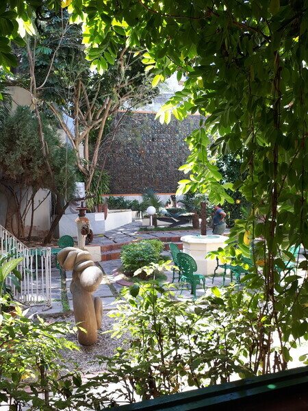
Havana Courtyard
Recently I went to Cuba for the first time. Ahead of the trip I knew little about Cuban art, but as it turns out there's a fabulous tradition of visual arts and craft as well as the more stereotypical music and dance scenes. There were two sites in Havana that were particularly interesting.
The first was the Museo Nacional de Bellas Artes de Cuba, in particular the building housing the Cuban collection. It was a fabulous collection of Cuban painters from colonial days until the present and featured some of their best known artists.
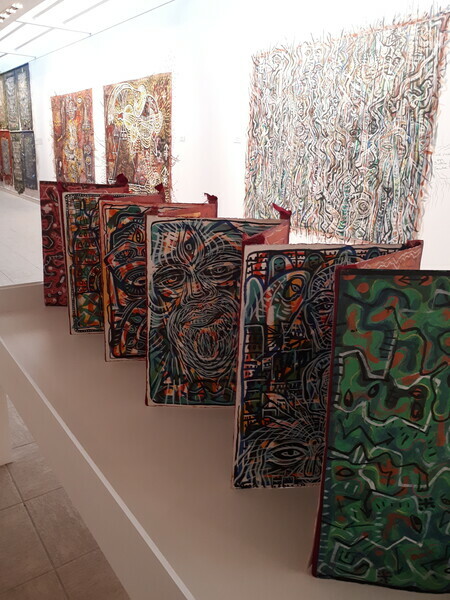
Exhibit of work by Leandro Soto
The second was the Fabrica de Arte Cubano, a converted paper mill that serves as an exhibition space for the visual arts, dance, music, theatre, film, etc, as well as housing a bar, nightclub and restaurant. With a clear focus on modern art, this was clearly one of the 21st century hubs for the Havana arts scene.
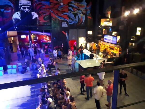
FAC Dance stage and bar
While I can't say that this brief trip provided enough time to truly immerse myself in Cuban art, it certainly provided an interesting taste of what I've been missing so far! Here's the link to Wikipedia for a brief synopsis, if you want a start on further reading.
I recently attended a workshop on framing watercolours without glass. The basic idea is to mount the finished watercolour on a wooden cradle and then finish the surface with varnish or an equivalent. The painting can then be hung without a frame (on a deep cradle) or framed like an acrylic or oil i.e., without a mat or glass.
Step one is to "glue" the watercolour to the wooden cradle, using acrylic polymer gloss medium, with or without GAC100 added. These are all archival materials. Once the watercolour is glued in place, its edges are trimmed to match the size of the wooden panel. At that point there are two options:
1. Dorland's cold wax can be spread over the surface, dried, then buffed. This protects the surface (in lieu of varnish). Photo below, the painting on the top right - here it is drying and not yet buffed up.
2. The surface can be painted with more acrylic gloss medium (enough coats to create an even sheen), then once dry, an archival spray varnish can be sprayed over this separation coat. Photo below, bottom painting.
The sides of the cradle are painted using acrylic full body paint.
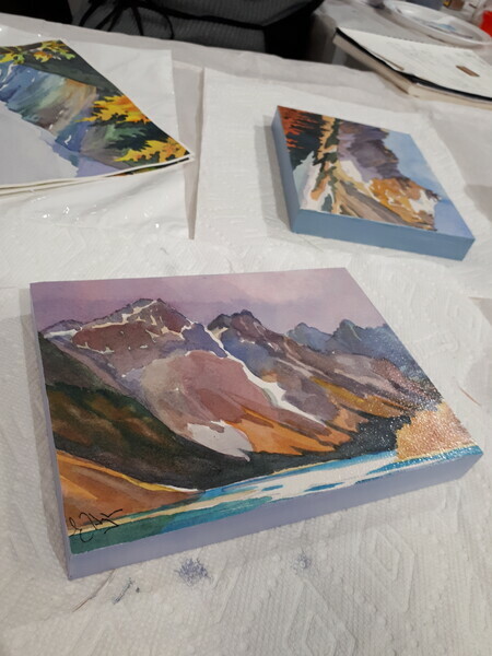
The result is attractive and it keeps costs down substantially as framing costs can be reduced or even eliminated.
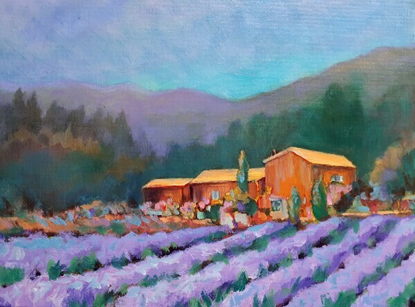
So, I decided to take an armchair travel art workshop. I love Dreama Tolle Perry's art and she had an online oil painting workshop based in one of my favourite places in the world - Provence! So I signed up and have been happily mucking about painting romantic images of various Provencal delights. Dreama's Website
So the one big issue is that I haven't painted in oils for decades, and have been trying to learn acrylics, so after inquiry I decided to try the course out using Golden Open Acrylics
These are described by Golden as " a slow-drying paint with a slightly softer consistency than our Heavy Body paints. The increased working time of these colors expands their range to include more traditional techniques once only possible with oils." In short, they stay wet a long time, especially if applied thickly. So it is possible to work alla prima with them, and do more blending than is usual with acrylics.
It's also possible to make horrible messes with them, haha. Many of them are very transparent and there is a dearth of opaque colours. You need to apply them thinly if you want them to dry within a day or two. They get tacky on the palette but can be thinned with one of the mediums that Golden makes for the Open line.
I am still reserving judgement on them. I don't know if my struggles with them are due to lack of familiarity with them, or if they are truly as awful as they seem. Some of the colours are horrible (eg. there's an ugly sap green that seems good for nothing except making mud). So my initial impression is that if you want to paint with paints that dry slowly, go buy oils. My future in acrylics will most likely involve going back to the traditional heavy body paints.
What to do with my leftover Open acrylics? I think once this course is over I will use them up doing monotype prints.
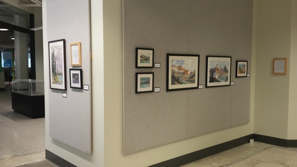
I thought I'd just post a few images from my Graduating Exhibit at the University of Alberta, Faculty of Extension in June 2017. It was the last of my program requirements for my Visual Arts Certificate, although my formal graduation won't be until the spring of 2018. I was honoured to have two of my mentors, Jerry Heine and Gregg Johnson, attend the exhibit, along with friends, family, colleagues and fellow Visual Arts students and instructors. As well as a few random street kids who ate lots of snacks but politely looked at the art!
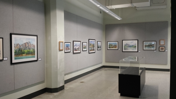
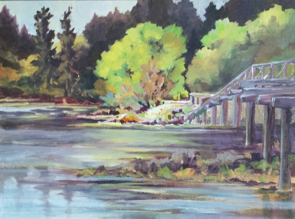
I had over 30 paintings ranging in size from 5" x 7" miniatures up to full sheet 22" x 30" size. All scenes in and around the Rocky Mountains - primarily Banff, Jasper, the Icefields Parkway and Valemount. All the framing was done by Westshore Custom Picture Framing in Langford, BC.
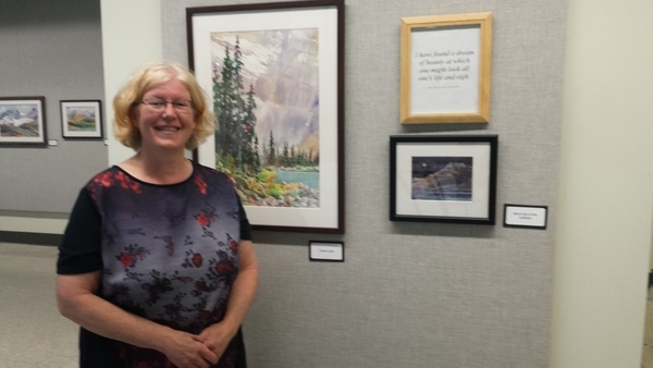
Along with all the paintings I had some famous quotes about the mountains and their inspirational qualities.
Last but not least, here is my artist's statement from this show - my first solo exhibition!
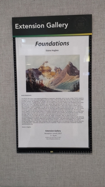
I hope everyone who was there enjoyed the show and it was nice to sell a few paintings too!
Painting en plein air is a time honoured tradition. Most of my instructors and mentors extoll its virtues. I've done loads of workshops and courses en plein air - most recently this month - and I do always see the value. You work quickly, which often allows you to capture the mood and lighting of the scene in a way that is very fresh. It's excellent practice at simplifying complex subjects and creating compositions. It's difficult too - conditions change rapidly and the light you are painting in doesn't match the indoor lighting under which your painting will be viewed.
Here's one that I liked that I did in a recent workshop. "Esquimault Lagoon" Acrylic on canvas panel.
Of course, I should say that I hate it. It's always too hot, too cold, too windy, too buggy. It's hard to find a comfortable spot and your paint dries too rapidly. I rarely like my plein air work compared to my studio work. I usually just do it as a challenge to get me out of my comfort zone but honestly I'd probably have a better time just sitting around a campfire or reading a book on the beach if I want to spend time outdoors.
Still, I keep trying .... just joined a local plein air group and plan to start getting out there after some upcoming travel is over.
Since I've been doing blog posts about some of my mentors, I thought I'd do the next one on Jerry Heine. Jerry was a friend of my Grandfather and it was more or less a coincidence that I ended up in his classes at the University of Alberta Faculty of Extension. His bio and works are available at the Bugera Matheson Gallery website: http://bugeramathesongallery.com/artist-item/heine-jerry/
I love Jerry's use of colour and value. I'm constantly striving to integrate his sage advice into my watercolours. Two areas in which he excels are the use of wet-on-wet techniques (let the paint do what it will do, and let the colours mix on the page .... all in a fashion not entirely outside the artists control), and leaving the white of the paper as his lightest lights. Combined with deep colour saturation in his darkest darks, he creates amazing effects.
For me much of what I love about his painting style is best illustrated by his large waterfall paintings. I'll upload a couple of them here although many more are available on the Bugera Matheson website, above. Once you see them, you'll see what I mean!
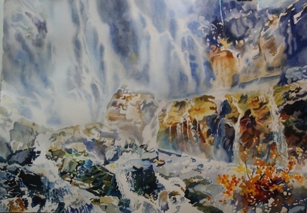
Jerry Heine, "Below Stanley Glacier"
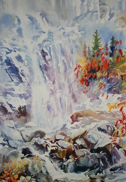
Jerry Heine, Autumn Falls
One of my mentors is Edmonton artist Gregg Johnson. Gregg was my high school art teacher. Years later, I discovered him running plein air art workshops in Jasper National Park. I attended these sessions for several years. While Gregg has retired from doing the intensive workshops now, for years he ran weekend workshops every spring and fall out of the hall at his church, and a loyal following of watercolour enthusiasts (myself included) returned time and again to participate. Now that I live in Victoria I miss his leadership and inspiration.
Gregg is not afraid of colour. Anyone who thinks of watercolour as a medium of pale pastels has never seen Gregg's work! One of his challenges to me has always been to push my limits - be bolder, less realistic, more vivid. Use lots of paint and let it flow! I've not yet mastered this but every time I return to his work or his workshops, I try once more.
A simple example or two will suffice. Do you think the sky needs to be blue? Gregg doesn't. Here are a couple of examples:
![]()
A Golden Beacon, Gregg Johnson
![]()
A Beacon Gone, Gregg Johnson
For more of Gregg's work, see his webpage, www.watercolors.ca/ or at the Picture This! gallery website at: http://www.picturethisgallery.com/gregg-johnson-original-art/
I first got interested in watercolour collage when I stumbled across the work of Gerald Brommer. He's written loads of books on the subject, and although he doesn't have a big web presence I was able to find a couple of spots where his work is online. One is Fishink, where I found some examples of his work to showcase:
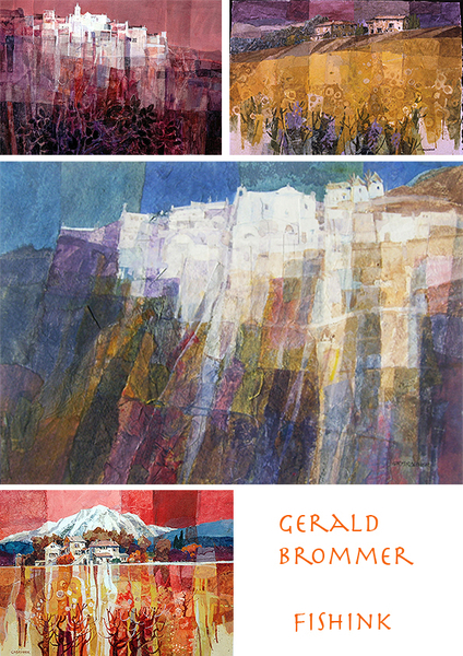
He has some of his work at New Masters Gallery as well. While I was vaguely familiar with collage as a modern art technique invented and popularized by famous artists Pablo Picasso and Georges Braque, it was Gerald Brommer's use of the technique in landscapes, especially his hilltop villages, that really got me going.
I've used collage with watercolour several times now, both as a primary technique and also as a way of "rescuing" a painting that didn't seem to be working (or where one area had become an irretrievable mess). It is slow but fun, and is something that I found I liked to do alongside a "pure" watercolour of the same subject. While one dried, I could work on the other. Collage does create a big mess relative to watercolours, but it is more like fun and less like work, at least to me.
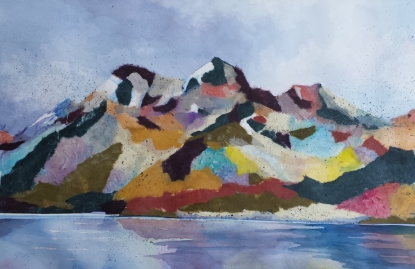
Maligne Lake, 15" x 22" watercolour, torn paper, and acrylic medium
It's definitely an area for further exploration, perhaps with acrylic, perhaps with ink.
For those interested in the technique, whether with watercolour or other media, I highly recommend Brommer's book Collage Techniques: A Guide for Artists and Illustrators.
I've very little to say about the topic of how to keep working steadily on ones art. I'm really bad at it. Painting is hard work for me, not the "fun" that it seems to many artists. I find that producing "product" for some sort of goal (a specific show, for example) keeps me working. I'm not so great at disciplining myself to paint every day, although I do at least try to do something art-related each day. For example, today I was reading the late Robert Genn's website, The Painters Keys, for some of his pearls of wisdom on motivation. http://painterskeys.com/motivation/
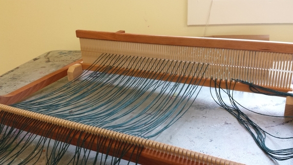
As a result of my inability to press on with the hard work of painting, I often get distracted by other crafts. Last weekend I went to a workshop on rigid heddle weaving. Indeed, I own a loom, which has gathered dust for a number of years. The workshop was a blast, and now I want to find my loom and start weaving again. Of course, I have a half-finished painting triggering vague feelings of guilt.
Over the years I've been distracted by pottery (which I'd also like to take up again!), as well as tie dye, jewellery making, cross stitch, quilting, creative writing, basketry, sewing ... and of course other 2D media besides watercolour, including ink, pastel, oils and acrylics. No wonder I never have time to paint!
The big plan for the future is to actually set up a dedicated studio and then actually use it. Right after I walk the dog ...
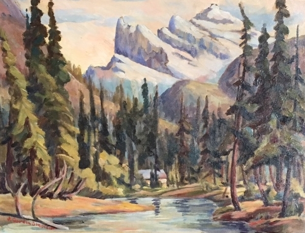
When I was little I always wanted crayons for Christmas, and by the time I was in elementary school my Grandpa started to teach me to draw with charcoal, then pastel. Eventually we turned to oil paints and colour charts. Grandpa, as it turned out, was artist J. Gordon Sinclair (1889 - 1980).
Born in Komoka, Ontario, he moved to Edmonton, Alberta in 1912. He taught art and design at the Edmonton Technical School for 25 years, and was a lifelong oil painter (with the occasional watercolour that crept in). He had a great deal of formal training in art from places like the Chicago Art Institute, www.saic.edu/ and the University of Washington, washington.edu He studied with J.W. Beatty, and had a swack of connections to the Canadian art community. He was a Charter member of the Edmonton Art Club, edmontonartclub.com/ (founded 1921) and the Alberta Society of Artists, albertasocietyofartists.com/ , the first professional juried art organization in the province, founded in 1931 (their first president was A.C. Leighton). Gordon aka Grandpa was also the Western regional organizer of the Federation of Canadian Artists artists.ca/ That national organization was founded in 1941, and he was participating on equal footing with colleagues such as Lawren Harris (who organized the West Coast) and A.Y. Jackson (who organized Ontario).
Grandpa loved plein air painting, and spent his summers most years in the Rocky Mountains, most often in Jasper National Park. He was a prolific artist and painted hundreds of paintings over his lifetime, many of them on hardboard (masonite) as well as on canvas. Small plein air boards were often turned into larger canvas pieces at his Edmonton studio in Garneau.
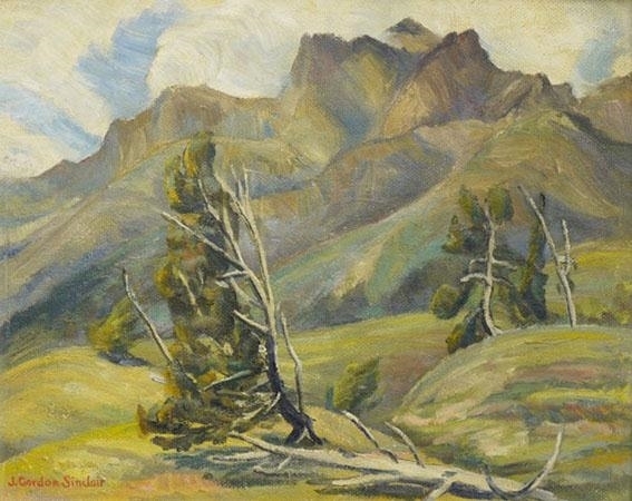
While I can't say I like to paint outdoors as much as he did, I certainly love the mountains, and focussed on them for quite some time. My recent move to the West Coast is starting to have its influence, as suddenly coastal forests and beaches are drawing me in. I predict a shift in focus very soon.
I wish I knew more details off the top of my head about Grandpa but he died when I was barely out of my teens, and had retired from painting years before due to age and infirmity. The family has a box of clippings though, and I think I'll have to spend a bit more time with them in the future.
In the mean time, thanks Grandpa!
More information about the early years of the ASA can be found in Kathy Zimon's book Alberta Society of Artists: The First Seventy Years while more information about the history of the FCA can be found in Ellen Poole's online publication 65 Years of Artistic Achievement: A History of the FCA.
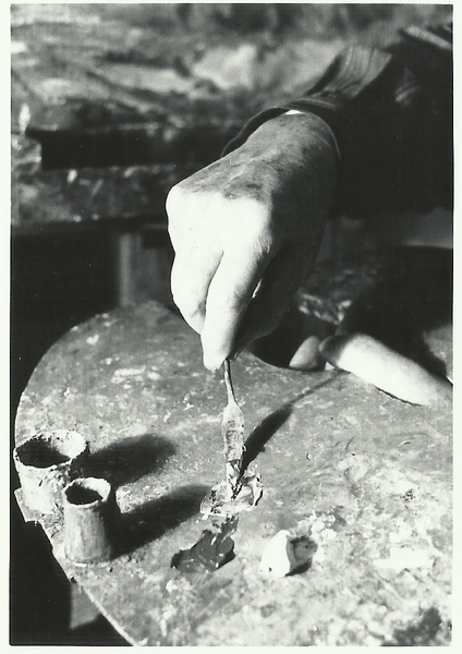
Grandpa mixing paint